How To Design Apartment Leasing Banners and Brochures
October 18, 2018 11:18 am Leave your thoughtsIn the world of apartment leasing, printed materials are the silent yet persuasive salespeople who work around the clock. Sometimes they are the first point of contact between a property and potential tenants. Their role is critical in making a lasting impression that can tip the scales from just another option to someone’s chosen home.
We want to help guide property managers and owners in crafting leasing materials that don’t just catch the eye but also speak directly to the hearts and minds of their audience. We want to show you how your print materials can turn leads into leases.
Creating leasing banners, flyers, and brochures for apartments requires strategy. It involves a deep understanding of who your audience is and what they want in a home. The right blend of compelling visuals and targeted messaging does more than tell them about your apartments; it connects. This guide is designed to arm you with practical, effective strategies that will elevate your leasing materials from mere information carriers to powerful tools that engage, persuade, and ultimately convert prospects into tenants.
At Market Apartments, we’ve mastered the craft of designing apartment marketing materials that make a lasting impression. Follow me as I share our top strategies and insights, developed through years of experience, to help you attract and engage potential tenants like never before.
Understanding Your Audience
Understanding your audience is the cornerstone of designing impactful apartment “now leasing” banners, brochures, or any other print materials. It’s about knowing who will be reading your materials and what they are looking for in a home. This understanding shapes everything from the design to the messaging of your leasing materials.
Identifying your target demographic is so important. Are your potential tenants young professionals, families, or retirees? Each group has different needs and preferences. For instance, young professionals might be drawn to high-speed internet and a modern gym, while families might prioritize safety and nearby schools. Knowing what they might be looking for lets you tailor your design and content to speak directly to their desires and needs.
Demographics massively influence your design and approach. The visual appeal and messaging should resonate with your audience. If your target demographic is older, a clean, easy-to-read design with information about community and security might be effective, so keep that in mind if you have a senior living complex. On the other hand, a younger audience might be more attracted to vibrant colors and imagery showcasing a lively community and nearby amenities.
A deep dive into the needs, preferences, and pain points of potential tenants can make your leasing materials much more effective. Conduct surveys or focus groups to gather insights. Are they looking for convenience, affordability, or luxury? Understanding these aspects helps you craft a message that not only informs but also connects on an emotional level. For example, highlighting a state-of-the-art kitchen might appeal to someone who loves cooking, while emphasizing a quiet, peaceful environment could attract tenants seeking a sanctuary from the busy city life.
Key Elements of Effective Leasing Banners and Brochures
In designing effective apartment leasing material, color schemes play an important role. They’re not just about looking good; they set the mood and tone of your property. Imagine a text with warm, earthy tones, suggesting a cozy, welcoming community, or cool blues and greens for a serene, modern vibe. The right colors can speak volumes before a single word is read.
Choosing fonts is just as important. Fonts are the voice of your banner. A clean, bold font grabs attention and conveys confidence, while a more elegant script might suggest luxury and exclusivity.
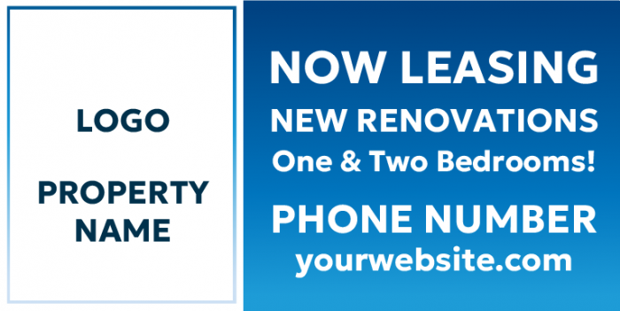
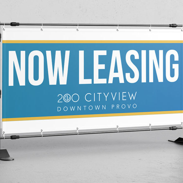
Remember, readability is key. We recommend sans-serif fonts to improve readability on banners, enhancing message clarity from a distance. You want potential tenants to read your message effortlessly from a distance. Our “now leasing” banners are designed with eye-catching colors and bold fonts to grab the attention of passersby, making them an indispensable tool in our marketing arsenal.
Imagery is your silent storyteller. It’s about showing, not just telling. A picture of a sunlit patio with people enjoying a barbecue tells a story of community and leisure, without you having to say much (if anything at all). Photos should reflect the lifestyle your property offers, whether it’s vibrant city living or peaceful suburban retreat.
Now, the call to action – this is where you seal the deal. It’s not just about saying “Now Leasing.” It’s about creating a sense of urgency and interest. For example, “Your New Home Awaits – Inquire Today!” invites action and personal connection. Or, “Join Our Community – Limited Spaces Available!” creates a sense of exclusivity and urgency. These are more than phrases; they’re invitations to a new life chapter. To capture immediate interest, our “Apartment Now Leasing” signs are strategically placed in high traffic areas to highlight the immediate availability, drawing in those on an urgent search for their next home.
Influencing Decisions Through Printed Materials
A well-structured layout guides the reader’s eye, making sure key information stands out. Placing high-impact visuals at the top of brochures draws immediate attention, while concise, compelling text follows to maintain interest. Doing it this way means the most crucial details, like contact information and calls to action, are easy to spot.
You need persuasive elements in flyers, brochures, and business cards to help drive decision-making. Use persuasive language that emphasizes the lifestyle benefits of the property, like “Your Dream Home Awaits” or “Experience Luxury Living.” Incorporate testimonials from satisfied tenants to build trust and credibility. High-quality images of the property, amenities, and surrounding area make them even more appealing, so your print materials aren’t just informative but aspirational.
Examples of successful materials include brochures with property maps, highlighting nearby attractions and conveniences. Business cards that double as appointment reminders have proven effective in encouraging follow-up actions. Banners that showcase real-time availability or special offers create a sense of urgency, prompting quicker decision-making from potential tenants. Keep these things in mind when designing your new print materials.
Balancing Text and Images in Leasing Materials
It’s important to create harmony between text and images in banners, brochures, and flyers. Best practices suggest a 60/40 ratio of visuals to text, ensuring the message is clear without overwhelming the audience.
Effective leasing banner designs combine compelling imagery with clear, actionable messages that guide prospects towards making an inquiry. For banners, a striking image of the property with minimal text like “Luxury Living Awaits” can quickly capture attention.
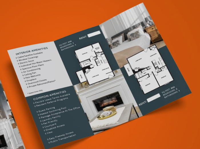
Brochures, on the other hand, benefit from a balance; a front page with an inviting image of the apartment complex, followed by interior shots paired with concise descriptions inside.
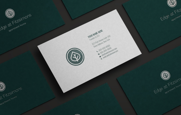
Business cards should be simple yet elegant, featuring the property’s logo and essential contact information, while flyers can be more image-heavy, showcasing amenities and lifestyle with short, impactful phrases.
Common mistakes in design include cluttered layouts and mismatched color schemes. Overloading banners with text or using tiny fonts in brochures can turn off potential tenants. Your texts need to be easy to read. It’s also important to make sure that the color palette reflects the property’s ambiance. A brochure for a beachfront property might use blues and sandy tones, evoking a sense of calm and relaxation. In contrast, a downtown high-rise might opt for sleek, monochromatic tones to convey modern sophistication.
Brand Consistency in Leasing Material Design
Think of your leasing banners and brochures as an extension of your property’s website and logo. They should mirror the style, colors, and tone of your brand. You want to make sure that when potential tenants see your materials, they instantly recognize and connect them with your property. It’s like seeing a familiar face in a crowd; it builds trust and a sense of reliability.
Maintaining brand consistency requires a strategic approach. Start by defining your brand’s core elements – colors, fonts, imagery, and tone of voice. These should be consistent across all materials. For instance, if your website features a modern, minimalist design with a specific color palette, your brochures and banners should reflect the same style. Use the same fonts and color schemes to create a seamless brand experience. Consistency in design elements makes your brand memorable and helps in building a strong, recognizable identity.
The Latest Trends in Leasing Design
Today’s visual leasing materials are embracing minimalism with a focus on high-quality images and less text. This shift towards visual storytelling allows potential tenants to envision themselves in the space.
The use of bold, contrasting colors is on the rise, helping materials stand out in a crowded market. Interactive elements, like QR codes linking to virtual tours, are becoming increasingly popular, offering a seamless a seamless link between physical and digital content.
Adapting Trends While Maintaining Brand Identity
While it’s tempting to jump on every design trend, you need to filter them through your brand’s lens. If your brand identity is centered around luxury and exclusivity, incorporating trendy elements like bold color contrasts should be done subtly to maintain an air of sophistication. If your brand is more about community and warmth, trends like minimalism can be adapted with warm colors and images showcasing communal spaces and happy residents.
Influence of Trends on Tenant Expectations and Choices
Trends do more than just make your materials look current; they shape tenant expectations. Today’s renters are looking for modern, convenient living spaces, and your marketing materials need to reflect that. A brochure that highlights smart home features or a banner that showcases a sleek, modern design can speak volumes to tech-savvy young professionals. On the flip side, families might be more influenced by brochures showing spacious, safe, and family-friendly environments.
Using Testimonials and Reviews
Testimonials and reviews serve as social proof, offering potential tenants a glimpse into the experiences of others. When used effectively in banners and brochures, they can significantly enhance the appeal of your property.
Best practices for incorporating testimonials involve selecting quotes that are relatable and reflect the diverse experiences of your tenants. Choose testimonials that speak to the various aspects of living in your property – from the convenience of its location to the quality of amenities. It’s also crucial to ensure authenticity; use real statements from actual tenants and, if possible, include their first name and initial of their last name for a personal touch.
Examples of incorporating testimonials effectively include placing a compelling quote at the top of a brochure, immediately drawing the reader’s attention. In banners, consider using shorter, impactful testimonials that can be read quickly and from a distance. For example, “A perfect place to call home – John S.” or “Love the community vibe here – Emily R.” These snippets provide a quick but powerful endorsement of your property.
Legal Considerations in Leasing Material Design
When designing leasing materials, you need to be aware of advertising laws and regulations. Following these rules means that your materials are not only effective but also legally compliant. For instance, the Fair Housing Act prohibits discrimination in housing-related advertising. This means your materials should not imply preference or limitation based on race, religion, gender, or other protected classes. Also, be mindful of state-specific regulations that might affect how you can advertise rental properties.
A common legal mistake in leasing material design is making misleading claims. Avoid statements that could be interpreted as guarantees, like “the perfect home for everyone.” Such claims can lead to legal challenges. It’s also important to ensure that all the information in your materials is accurate and up-to-date. If you mention amenities or features, they must be available and as you described them. Misrepresentation, even unintentional, can lead to significant legal issues.
It’s wise to consult with legal experts, especially when drafting the text. They can help you navigate the complex landscape of advertising and housing laws. Regularly review and update your materials to reflect any changes in your offerings or in legal requirements. Also, consider including a disclaimer stating that all information is subject to change and should be verified directly with the property.
Material and Finish Selection
Durability and quality are key when choosing materials. For outdoor banners, consider weather-resistant fabrics like vinyl or polyester, which can withstand rain, wind, and sun without fading or tearing. For brochures, a thicker, high-quality paper gives a sense of luxury and durability, making a strong impression on potential tenants.
Visual impact is significantly enhanced by the right finishes. Glossy finishes on brochures catch the eye and feel smooth to the touch, conveying a modern and upscale image. Matte finishes, on the other hand, offer a more subtle, elegant appeal and are easier to read under bright lights. For banners, a high-resolution print with vibrant colors can make a striking visual statement, drawing attention from a distance.
Creative apartment leasing brochure ideas include interactive elements like fold-outs and pop-ups, making the information engaging and memorable.
Cost Vs. Benefit Of Materials
When considering investing in apartment leasing banners and brochures, it’s important to weigh the costs against the benefits. Balancing cost and quality is essential in material selection. Banners and brochures may seem expensive at first, but they bring significant returns. These materials can lead to more tours and, ultimately, more leases.
On the other hand, it’s essential to ensure that your investment is well-spent. To get the most value, focus on creating attractive, clear, and informative banners and brochures. Tracking how many new renters come from these materials can help you see if the benefits outweigh the costs. In the long run, effective print marketing can be an extremely cost-effective way to boost your leasing success.
Measuring the Effectiveness of Leasing Materials
Let’s dive into practical tools and metrics for tracking their performance. First, consider using unique tracking phone numbers on each material. This approach allows you to pinpoint which banner or brochure prompts the most calls. It’s a straightforward yet powerful way to measure direct engagement.
Another effective tool is QR codes. Embed these on your materials, linking to a specific landing page on your website. By tracking the number of scans and subsequent actions on your site, you gain insights into how engaging your materials are. This method bridges the gap between physical and digital marketing, offering a comprehensive view of your audience’s behavior.
Interpreting the data you gather is key to refining your strategy. Let’s say your brochure with a community-focused theme gets more scans than the one highlighting luxury amenities. This indicates that your audience values community aspects more. Use this insight to adjust your future designs and messages. Regularly analyze the data to identify trends and preferences, ensuring your leasing materials evolve with your audience’s needs.
Data-Driven Design Decisions
The power of data in shaping design choices is undeniable. By analyzing data, property managers can make informed decisions about the aesthetics and messaging of their leasing materials. If data shows a high number of young families in the area, incorporating images of family-friendly amenities and using a warm, inviting color palette in your brochures can be more appealing. Similarly, data indicating a large population of young professionals might lead to designs that highlight sleek, modern apartments and state-of-the-art facilities.
Gathering this crucial data requires the right tools. Online surveys and social media analytics offer a wealth of information about potential tenants’ preferences and behaviors. Property managers can also use website analytics to understand what aspects of their property are most appealing to site visitors. For example, if a particular page about community events has high traffic, it suggests that prospects are interested in a vibrant community life, which you can reflect in the leasing materials. Incorporating digital marketing to promote multifamily apartments into our strategy allows you to connect with a wider audience, offering virtual tours and immediate engagement opportunities that printed materials alone cannot provide.
It’s important to remember that data isn’t just for initial design decisions; it’s also vital for ongoing adjustments. Continuous analysis of how prospects interact with your materials can lead to valuable insights. If certain brochures are more popular at open houses, or specific banners get more online clicks, these are indicators of what resonates with your audience. Adjusting your designs based on these insights ensures that your leasing materials remain effective and relevant.
Overcoming Common Design Challenges
Let’s dive into how to overcome common design challenges. We’ll share some solutions and insights from our work at Market Apartments.
One typical hurdle is creating materials that stand out in a crowded market. We found success by focusing on unique property features and tailoring our designs to reflect the lifestyle benefits these features offer. For instance, when highlighting a pet-friendly apartment, we didn’t just mention the policy; we showcased the on-site dog park with vibrant photos and testimonials from happy pet owners. This approach turned a standard amenity into a compelling selling point.
Another challenge is ensuring information is both accessible and engaging. We’ve learned that less is often more. By adopting a minimalist design, we emphasize key messages without overwhelming readers. For a project targeting busy professionals, we streamlined content to focus on convenience and luxury, using clean lines and a sophisticated color palette.
Elevating Lease Generation Through Strategic Print Marketing
Print services have a significant influence on the number of leases an apartment complex can generate, acting as a crucial touchpoint in the tenant acquisition process. High-quality, visually appealing banners and brochures serve as silent ambassadors for your property, offering a first glimpse into the lifestyle potential tenants could enjoy. The tactile nature of these materials adds a personal touch that digital advertising often lacks, creating a memorable experience for prospective renters.
On top of that, the strategic use of print materials can significantly improve the perceived value of your property. Tailored designs that speak directly to the desires and needs of your target demographic can elevate interest, drive engagement, and show that you care about the details when it comes to your property. Incorporating testimonials from satisfied residents in your brochures can build trust and credibility, while banners that highlight unique amenities or special offers create a sense of urgency and exclusivity.
Rebranding Your Print Materials
Rebranding your print materials for apartment marketing is really important because it keeps your property fresh and appealing. If you update your flyers, brochures, and other print materials regularly, you can attract more interest from potential renters. It’s a good idea to update your designs at least every 2 years to make sure your materials stay current. Regular updates help keep your marketing effective and your property looking its best.
Budgeting and Ordering
Designing impactful apartment leasing materials doesn’t have to break the bank. MarketApts shines here, offering a variety of print services at rates that respect your marketing budget. The secret lies in striking the perfect balance between cost and quality, ensuring your banners and brochures don’t just catch the eye but hold it, compelling potential tenants to take a closer look.
For starters, consider the power of simplicity. A minimalist approach can significantly reduce costs while ensuring your message is clear and engaging. MarketApts excels in creating designs that are both budget-friendly and visually stunning, utilizing colors, fonts, and imagery that speak directly to your target audience without overwhelming them with unnecessary details.
Examples of high-impact, budget-friendly materials from Market Apartments include sleek brochures that highlight key amenities with professional photography and banners that make a bold statement with just a few words. These materials prove that with the right design team, you can create leasing tools that not only fit your budget but also set your property apart in a competitive market.
To explore the range of physical leasing products we offer that can transform your marketing efforts, take a look at our comprehensive selection.
Do you want it? We’ve got it.
We’ve got the team to produce virtually anything you need when it comes to print and design. From business cards to massive banners, we can get you what you need to help spread the word about your property
Business Cards
Lightweight, memorable, and oh-so-affordable. Business cards are good to have in leasing offices or give them to people as you meet them.
Apartment Brochures and Flyers
Thoughtful designs that answer questions and invite action. Brochures have the same function as flyers. However, they look different because brochures are always folded. A good brochure helps show off your property and tell people about your community. It can make renters interested and give a professional look to your property
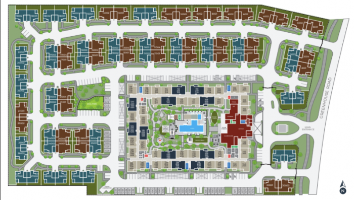
Interactive Site Maps
Art with a purpose. Information and appeal for your property office. A well-designed map can be used both in print and online, helping future renters see where their further apartment will be. Do you need an interactive site map for your apartment community? No problem, contact our team to discuss your project. Site maps are also a great tool to use when marketing an apartment complex.
Banners:
Are banners still a relevant part of your marketing campaign? Bold statements to draw traffic and start a conversation. Unlike other types of marketing strategies, banners are usually cheaper to create and share.
And That’s Not All
Implementing these strategies for designing impactful apartment leasing banners and brochures can make a huge difference in your leasing results. As the landscape of leasing material design continues to evolve, staying ahead with innovative and effective designs is super important. If crafting these materials seems difficult, Market Apartments is here to help. We’ve been doing this for a long time and would love to work with you.
There’s so much more that we can do for you! Contact our team to hear about our additional print service offerings, and to line up your next project. Or talk to us about multi-family SEO and marketing questions, website upgrades, apartment social media, or your Fantasy Football lineup! (Ok, probably not that last one)…
Categorised in: Apartment Marketing, For Property Managers
This post was written by Isabella Housel
Isabella Housel is a passionate and versatile professional writer with a deep love for words and a commitment to crafting compelling content that engages, informs, and inspires. With many years of experience in the industry, she has honed her skills across various genres, from creative storytelling to informative articles and technical documentation.

