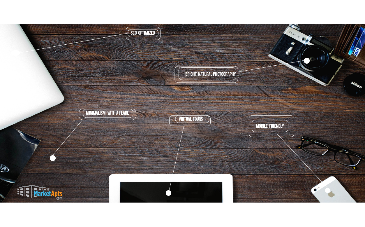
In the crowded world of apartment hunting, standing out is not just an option; it’s a necessity. The rental market is fiercely competitive, with countless communities competing for the attention of potential tenants. In this landscape, an apartment website must be more than just a digital brochure. It’s a crucial tool in capturing interest, building trust, and ultimately, convincing someone to call your property “home.”
That’s why you need an apartment website design with a marketing-first approach. It’s about creating websites that prioritize marketing strategies to attract, engage, and convert potential tenants. Its more than online platforms for apartment listings. Its significance lies in its ability to stand out in a competitive market, provide a better user experience, and ultimately increase occupancy rates. The evolution of apartment website design has moved from simple listings to complex, interactive platforms that incorporate advanced marketing techniques like SEO, user behavior analytics, and personalized content.
This article focuses on website design that looks great and performs well. You’ll learn how good design supports both appearance and usability. We’ll start with the basics, understanding of web design and the key elements that make a site attractive and easy to navigate. Then, we’ll move into more advanced territory, exploring strategies that can set your site apart, like integrating virtual tours or leveraging social proof.
By the end, you’ll have a toolkit of ideas and strategies, ready to transform your website into a powerful marketing ally. This isn’t just about learning; it’s about mastering the craft of making your website a pivotal part of your marketing arsenal.
Understanding Your Audience
Defining User’s Intent
In the dynamic world of apartment hunting, understanding the renter’s journey is key. Renters typically navigate through several stages: initial exploration, comparison, and final decision-making. At the outset, they might be casually browsing, not yet committed to moving. As they progress, their search becomes more focused, comparing amenities, prices, and locations.
Finally, they reach a decision point, where specific details and unique selling points become crucial in choosing their next home. Recognizing these stages enables the creation of tailored website content that resonates with renters at each stage of their journey.
Segmenting the Audience
The audience for apartment rentals is diverse, encompassing students, professionals, families, and retirees. Each group has distinct preferences and priorities. For instance, students might prioritize affordability and proximity to campuses, while families might look for spacious layouts and nearby schools.
By segmenting the audience demographically and psychographically, property managers can create more targeted, relevant content. This segmentation not only enhances user experience but also increases the likelihood of conversions by addressing the specific needs and desires of each group.
Aligning with Search Intent
To effectively align with search intent, it’s crucial to understand what potential renters are looking for online. Some might enter broad search terms like “apartments near me,” while others might have specific requirements such as “pet-friendly apartments downtown.” By incorporating these keywords into website content, you can improve search engine visibility and ensure that your site meets the specific needs of searchers.
Tailoring content to these search queries can help in presenting your property as a solution to their specific rental needs, thereby nudging them closer to a decision.
The Power of Design in Marketing
First Impressions Count
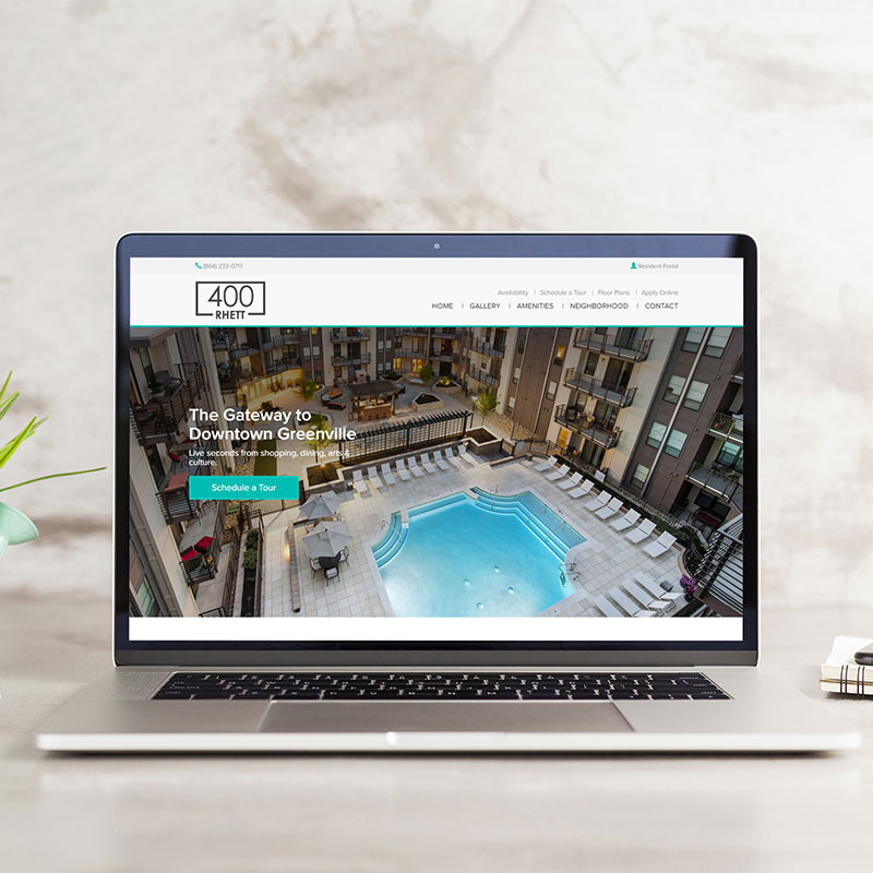
When someone lands on your apartment website, you have less than seven seconds to capture their interest. The design is the first thing they notice. It’s like the curb appeal of a digital property. A clean, modern layout with high-quality images of your apartments can instantly create a sense of trust and desire. Think of your website as your property’s digital handshake – it needs to be firm, warm, and inviting.
But it’s not just about looking pretty. The design must be intuitive. If potential renters can’t find what they’re looking for within a few clicks, they may leave and never return. Navigation should be straightforward, guiding visitors smoothly from one page to another, just like a well-planned tour of an apartment complex.
In my experience, the integration of user feedback into design decisions has been invaluable. Regularly updating the website based on user behavior analytics and feedback can significantly enhance the user experience. For instance, if data shows that users frequently visit the amenities page, placing a clear CTA on this page for scheduling a visit or contacting the leasing office can be a strategic move.
Beyond Aesthetics
Apartment web design extends beyond aesthetics. It’s about understanding human behavior and using that knowledge to guide potential tenants through their decision-making process. For instance, strategically placed calls-to-action can gently nudge visitors to schedule a viewing or contact the leasing office. Colors and fonts aren’t just about style; they evoke emotions and reactions. A calming color palette might make your site feel more welcoming, while clear, readable fonts ensure that visitors can easily absorb the information they need.
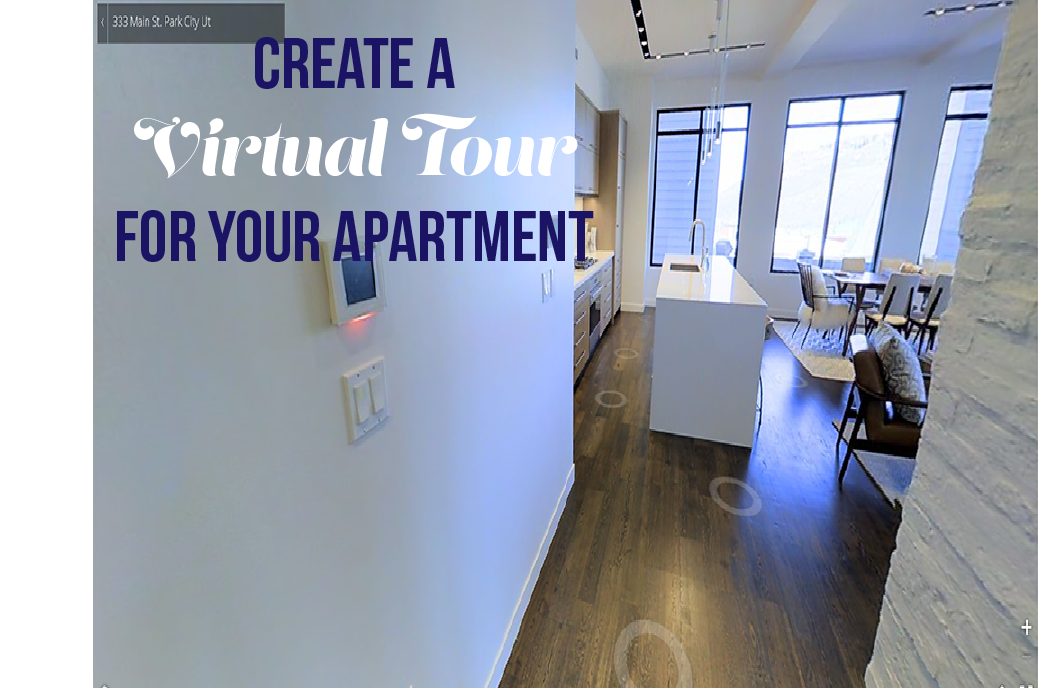
Moreover, incorporating elements like virtual tours or interactive floor plans can significantly enhance user engagement. These features allow visitors to envision themselves in the space, which is a powerful motivator in the decision-making process.
Marketing-First Design
At its core, your website should be a conversion tool. Every design element must have a purpose, driving visitors toward the goal of turning them into residents. This is where marketing-first design comes into play. Effective tenant conversion strategies are integral to your website design, ensuring that every visitor is a potential resident. It’s about creating a visual hierarchy that draws attention to the most important information, like special offers or unique amenities. It’s about understanding the psychology of persuasion and applying it through design.
For example, testimonials and reviews can be prominently featured to build credibility and trust. Highlighting the unique selling points of your property, like a prime location or pet-friendly policies, can differentiate you from the competition. Remember, it’s all about how you present it. The right rental property design can make your message more compelling and convincing.
Crafting a User-Centric Experience
Craft a user-centered experience that addresses common frustrations and improves the user experience from browsing to leasing.
Understanding Pain Points
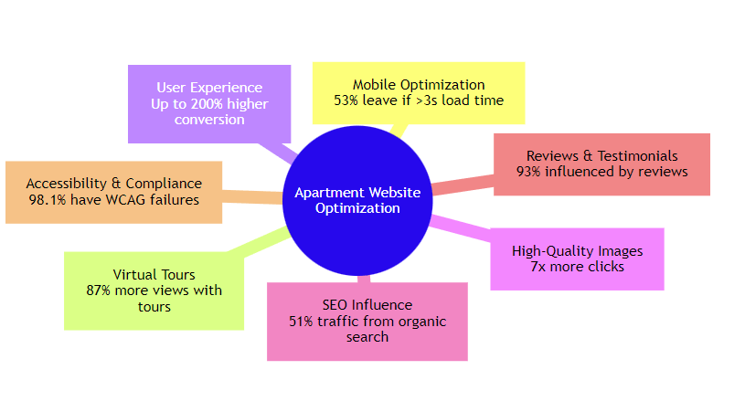
Let’s talk about the hurdles your website visitors could face. Ever landed on a website only to be greeted by slow load times or a maze of menus? Frustrating, isn’t it? A 1-second delay in page response can result in a 7% reduction in conversions. These are the types of pain points prospects encounter. They want quick and easy access to information, such as pricing, amenities, and availability.
If they can’t find it, they’ll move on. To address these issues, start by conducting user surveys or analyzing website data to pinpoint where users are dropping off. Then, streamline the content. Make sure key information is front and center, and the path to contact or apply is crystal clear.
Seamless Navigation
Next is navigation. It’s the roadmap guiding users through your site. A complex or confusing layout is like a bad GPS; it leads to dead ends and U-turns. To create an intuitive site structure, think like your user. Group related information together and maintain a consistent layout across pages. Use clear, descriptive labels for menus and links. Imagine you’re guiding a friend through the site. Where would they want to go next? Make that journey as smooth as possible.
Speed and Accessibility
Finally, let’s talk speed and accessibility. In our fast-paced world, a slow website isn’t just annoying; it’s a deal-breaker. Optimize images and streamline code to ensure your site loads quickly. But speed isn’t everything. Your site also needs to be accessible to everyone, including those with disabilities.
Use alt text for images, ensure text contrasts well with the background, and make sure your site is navigable with a keyboard. This isn’t just good practice; it’s good business. An accessible site reaches a wider audience and reflects your commitment to inclusivity.
Maximizing Visual Impact in Apartment Website Designs
Your website’s visual appeal isn’t just a nice-to-have; it’s a crucial factor in attracting and converting potential tenants. Here’s how you can use visuals so people not only visit your site but also remember it.
Choosing the Right Colors and Fonts
Colors are more than just a visual treat; they’re the silent ambassadors of your brand. Imagine the calmness of blue skies or the urgency of a red stop sign. These reactions aren’t by chance. They’re deeply ingrained responses that you can leverage. For instance, a splash of orange can invigorate and call to action, making it a perfect pick for ‘Apply Now’ buttons. On the other hand, a serene green might be just what you need to make your site feel like a peaceful haven in the city’s hustle.
Fonts, while often overlooked, play a crucial role too. They’re the costume that your words wear. A clean, sans-serif font like Arial conveys modern simplicity, making it perfect for a site that prides itself on sleek, minimalist design. For a touch of elegance, perhaps a serif font like Times New Roman will echo the timeless charm of your classic interiors.
Using High-Quality Images
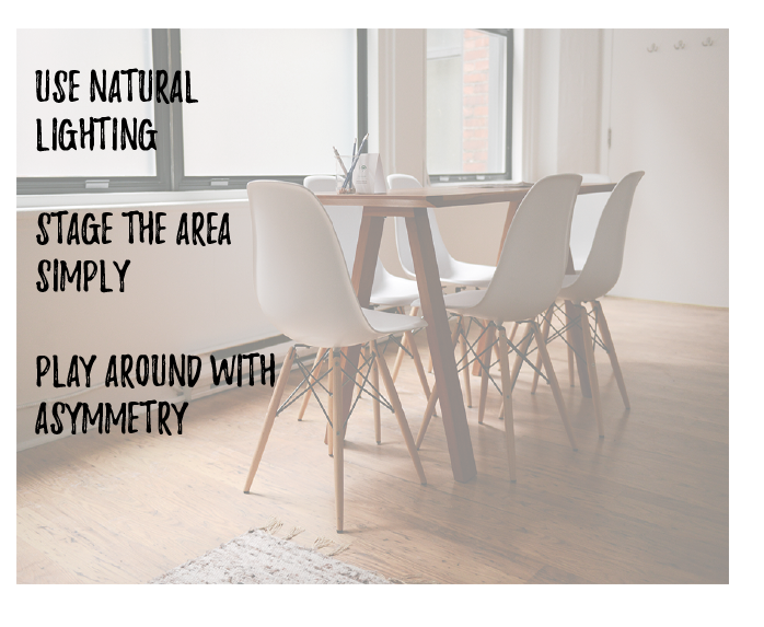
A picture is worth a thousand words, and on your website, it’s worth even more. High-quality images of your rental units are your secret weapon. They’re the virtual window through which potential tenants peek into their future homes. Content with relevant images receives 94% more views than content without them. But it’s not just about having pretty pictures; it’s about telling a story.
A well-staged photo of a sunny living room with a cozy reading nook whispers tales of lazy Sunday mornings. Virtual tours and 3D floor designs, on the other hand, are like personal guides, walking prospects through each room, helping them visualize their life in the space. It’s about creating a connection that words alone can’t achieve.
Layout Strategies
The layout of your website is the path you lay out for your visitors. It’s how you guide them from curiosity to conversion. Think of it as the layout of a well-designed apartment. Each room flows naturally into the next, creating a journey that’s both intuitive and enjoyable. Your homepage is your lobby, welcoming and directing. From there, each click should feel as natural as walking from the living room into the kitchen.
Keep your most important content, such as special offers and key amenities, at the forefront. This is just like highlighting the best features of an apartment during a tour.
Writing Content that Converts
Today’s renters seek a connection, a glimpse into the life they could lead. This is where the art of content that converts comes into play, blending persuasive writing with storytelling and a sense of community spirit to not only attract but also engage and convert potential tenants.
Crafting Compelling Copy
Imagine stepping into an apartment. What catches your eye first? Is it the spacious layout, the natural light flooding in, or perhaps the modern kitchen? Your website’s descriptions should act as a virtual tour, highlighting features and benefits in a way that resonates with potential renters. Use vivid language to paint a picture. Instead of saying “well-lit living room,” describe how the afternoon sun bathes the room in a warm, welcoming glow. This isn’t just about listing amenities; it’s about showcasing a lifestyle.
But remember, clarity is key. While it’s essential to be descriptive, your sentences should be concise and to the point, making it easy for readers to scan through and extract the necessary information. Use bullet points to break down complex information, ensuring that key benefits stand out.
One common misconception I’ve encountered is that overly sales-oriented language is the most effective in conversion. However, I’ve found that a balance between persuasive and informative content yields better results. Providing clear, detailed information about the property, while subtly weaving in persuasive elements, tends to resonate more with potential tenants.
Storytelling Techniques
Every apartment has a story, and your website is the perfect platform to tell it. Narratives create an emotional connection, transforming a property from a mere space to a potential home. Share stories of community events, tenant testimonials, or the history of the area. Let potential renters envision their future there. For instance, you could describe a typical weekend, from the bustling farmer’s market down the street to the serene afternoons spent by the poolside.
Incorporate multimedia elements like videos and images to complement your stories. A video tour of the neighborhood or a photo series of community events can add depth to your narrative, making it more engaging and relatable.
Creating a Sense of Community
An apartment is more than just walls and windows; it’s a community. Your website should reflect this. Highlight community features, whether it’s a shared garden, a fitness center, or regular social events. Share stories and testimonials from current residents to give a sense of the community spirit. This not only helps potential tenants visualize living there but also positions your property as a place where they can belong.
Consider adding a blog or a news section to your website where you can share updates, community stories, or tips for city living. This not only keeps the content fresh and engaging but also helps in establishing a connection with your audience.
Essential Website Features
- Property Maps: Interactive maps provide a bird’s-eye view of the property layout, offering a sense of location and proximity to key amenities.
- Floor Plans: Detailed floor plans enable potential tenants to visualize the space, facilitating informed decision-making.
- Video Tours: Virtual walkthroughs offer an immersive experience, showcasing the property’s features in a dynamic way.
- Photos of Available Units: High-quality images give a realistic glimpse into the living spaces, highlighting key attributes.
- Calls to Action (CTA): Strategically placed prompts encourage users to take the next step, whether it’s scheduling a visit or contacting the leasing office.
- Contact Page and Information: Easy access to contact details ensures potential tenants can reach out with ease.
- Reviews: Displaying tenant testimonials builds credibility and trust.
- Amenities: Detailed information about amenities sets the property apart, catering to the specific needs of tenants.
- Neighborhood Info: Insight into the surrounding area, including schools, safety, and local attractions, aids in painting a complete lifestyle picture.
- FAQ Section: Addressing common queries upfront simplifies the decision-making process for prospective tenants.
Calls to Action: Prompting Users Effectively
Effective CTAs are the bridge between browsing and action. They should be clear, compelling, and strategically placed to guide users naturally towards making a decision. For instance, a CTA like “Schedule a Virtual Tour” placed next to video tours can prompt immediate engagement. Similarly, the “Contact Us for Special Offers” section near the amenities can entice users to inquire, moving them closer to a decision. The key is to make these prompts resonate with the user’s current stage in their decision-making journey.
Social Proof and Testimonials: Building Trust
Social proof, in the form of testimonials and reviews, serves as a powerful trust-builder. Displaying real stories and experiences from current or past tenants adds a layer of authenticity and reliability. This can be further enhanced by including resident testimonials that speak to the community’s atmosphere, the quality of amenities, and the responsiveness of management. Integrating these elements not only builds trust but also creates a sense of community, making the property more appealing to potential tenants.
Basics of SEO for Apartments
In the digital age, where most apartment hunting begins online, mastering SEO is crucial for your website’s visibility. SEO, or Search Engine Optimization, is the art of making your website more attractive to search engines like Google. It’s about ensuring that when someone searches for apartments, your site stands out.
The essence of combining SEO with impactful web design lies in creating a site that’s not only visually engaging but also easily navigable and understandable by search engines. Technical aspects are crucial in this blend. For example, if search engines encounter difficulties in crawling and fetching your website’s content, or if there are broken links, your site’s ranking could be adversely affected. Search engines favor websites that deliver an excellent user experience, characterized by efficient navigation, quick content accessibility, and alignment with the searchers’ questions and interests.
Local SEO Tactics
When it comes to apartment rentals, local SEO is your best friend. It’s about targeting those searching for apartments in your specific area. Start by ensuring your website includes local keywords, like “apartments in [Your City].” Also, list your property on Google My Business and other local directories. This increases your visibility in local search results and maps, making it easier for potential tenants to find you.
Another local SEO strategy is to create content that resonates with your local audience. This could be blog posts about local events or guides to the neighborhood. Such content not only boosts your SEO but also helps potential tenants envision their life in your community.
Mobile Optimization
The significance of mobile-responsive design in apartment website development cannot be overstated. With an increasing number of prospects relying on smartphones and tablets for their apartment search, a mobile-optimized website is no longer a luxury. 57% of internet users say they won’t recommend a business with a poorly designed mobile website.
This shift towards mobile browsing demands that apartment websites be designed with responsiveness in mind, ensuring that content, images, and functionalities adapt seamlessly to various screen sizes. By prioritizing mobile optimization, apartment websites can effectively reach and engage a broader audience, making it easier for potential tenants to explore and connect with properties anytime, anywhere.
Best Practices for Mobile
Creating an exceptional mobile experience for apartment websites involves more than just a responsive design; it’s about understanding and catering to the mobile user’s needs. To achieve this, focus on simplifying navigation with a clean, uncluttered layout that allows users to find information quickly and effortlessly. Optimize loading times by compressing images and streamlining code, as mobile users often have less patience for slow-loading pages.
Touch-friendly interfaces with easily clickable buttons and links enhance usability, making it convenient for users to interact with the site. Additionally, consider the mobile user’s context, incorporate features like click-to-call for easy contact or location-based services to show nearby amenities.
Design Mistakes to Avoid
- Overwhelming Layouts: Simplicity is key. Avoid cluttered designs that overwhelm visitors. Opt for a clean, organized layout that guides users naturally through the site. Use whitespace effectively to create a breathable, easy-to-navigate interface.
- Slow Loading Times: Speed matters. A website that loads slowly can frustrate users and increase bounce rates. 47% of users expect a maximum of 2 seconds loading time for an average website. Optimize images, streamline code, and consider a reliable hosting service to enhance loading speeds.
- Inconsistent Branding: Consistency in design and messaging reinforces brand identity. Ensure your website reflects consistent branding elements like colors, fonts, and style to foster brand recognition and trust.
- Neglecting Accessibility: Accessibility is not just a legal requirement; it’s a moral obligation. Ensure your website is accessible to all, including those with disabilities. This includes using alt text for images, ensuring high contrast for readability, and providing keyboard navigation.
Content Mistakes to Avoid
- Generic Descriptions: Avoid bland, generic descriptions of properties. Instead, use descriptive language that paints a picture of the living experience. Highlight the unique features and amenities that make your property stand out.
- Outdated Information: Regularly update your website content to reflect current availability, pricing, and amenities. Outdated information can mislead potential renters and damage your credibility.
- Ignoring SEO Best Practices: SEO is crucial for online visibility. Neglecting SEO best practices, such as keyword integration, meta titles and headings can result in lower search engine rankings, reducing your website’s visibility.
- Lack of Clear Calls to Action (CTAs): CTAs guide users towards taking action, like scheduling a tour or contacting the leasing office. Ensure your CTAs are clear, compelling, and strategically placed throughout the website.
Market Apartments’ Success in Apartment Website Design
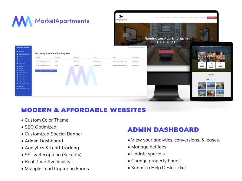
Our websites are not just fast; they’re strategically engineered for higher conversion rates. Here’s a glimpse into what makes MarketApts’s websites a game-changer in the industry:
- Speed and Efficiency: Our websites load faster than most in the real estate sector, ensuring that potential tenants enjoy a seamless browsing experience without any frustrating delays.
- Strategically Placed Calls to Action (CTAs): We don’t just add CTAs; we place them where they are most likely to convert. Whether it’s “Schedule a Viewing” or “Check Availability,” our CTAs are positioned to catch the user’s eye at the right moment.
- Immersive Visual Tours: Market Apartments leverages video tours and high-quality photos, allowing users to virtually step into their potential new home. This visual engagement significantly enhances the user experience (UX).
- Interactive Maps: Our websites feature detailed maps, offering users a comprehensive view of the property and its surroundings. This feature aids in visualizing the location and its conveniences.
- Lead Generation Forms: We incorporate forms that are easy to fill out, encouraging potential tenants to take the next step in their apartment search.
Learning from MarketApt Strategies for Success
MarketApt’s approach offers valuable lessons for anyone looking to excel in apartment website design:
- Clear Navigation: Our websites are designed with the user in mind, ensuring that information is easily accessible and the navigation through the site is intuitive.
- Enhanced Conversion Rates: The strategic placement of elements and information leads to higher engagement and conversion rates.
- Admin Dashboard for Lease Tracking: We provide property managers with a dashboard to monitor your website, making management more efficient.
- In-Depth Analytics: Understanding user behavior is key. Our websites offer detailed analytics, helping to tailor the user experience and improve performance.
- Dynamic Fee Updates: We enable easy updates for specials and pet fees, ensuring that the website always displays the most current information.
We differentiate ourselves by not just creating real estate websites but crafting experiences that resonate with both property managers and potential tenants. Our focus is on:
- User-Centric Design: We prioritize the end-user’s needs and preferences, ensuring a satisfying and engaging experience.
- Marketing-First Approach: Every design element is chosen with a marketing perspective, aimed not only at attracting but also converting visitors into tenants.
- Continuous Innovation: We stay ahead of the curve, constantly updating our strategies to align with the latest trends and technologies in real estate marketing.
Integrating Social Platforms into Apartment Websites
By linking your website to social media profiles, you create a seamless bridge between your online presence and your social interactions. This integration allows potential tenants to easily navigate from your website to your social media pages, where they can engage with your content, see community updates, and get a feel for the lifestyle your property offers. It’s about creating a cohesive digital ecosystem that extends the user experience beyond your website.
Leveraging Social Proof through Social Media
Social proof is a powerful tool in building credibility and trust, and social media platforms are ideal for showcasing this. By actively leveraging social media, you can highlight positive experiences of current residents, share glowing reviews, and post user-generated content that resonates with potential tenants.
Imagine a prospective tenant scrolling through your Facebook page, encountering posts where residents rave about the community spirit or share pictures of a recent event at the property. This authentic glimpse into life at your property can significantly sway their decision-making.
Innovative Features to Consider
Innovation in website design is not just about following trends; it’s about setting them. Consider integrating features like AI-powered recommendations. Imagine a visitor entering your site and being greeted with personalized apartment suggestions based on their browsing history or preferences. This not only saves time but also demonstrates a deep understanding of user needs.
Another groundbreaking feature is real-time availability updates. Prospective tenants can see up-to-the-minute information on available units, eliminating the frustration of inquiring about an already-leased unit. This feature speaks volumes about your commitment to transparency and customer service.
One trend I’m keeping an eye on is the use of augmented reality (AR) in apartment tours. Integrating AR features on the website, where potential tenants can virtually furnish and decorate the space, can provide an immersive experience that significantly boosts engagement and helps in the decision-making process
Personalization Techniques
Personalization is the key to creating a connection with your audience. Start by studying data analytics to understand user behavior. This insight allows you to tailor content, from personalized greetings to suggestions based on their search patterns. For example, if a user frequently searches for pet-friendly apartments, your site could highlight such properties or offer tips on pet-friendly living in the community.
Interactive quizzes or surveys can also enhance personalization. These tools engage users and gather information about their preferences, which can be used to customize their website experience. For instance, a quiz on ‘Find Your Perfect Apartment Style’ can be a fun way to engage users while also providing valuable insights into their preferences.
Interactive Elements
Interactive elements can significantly boost user engagement. Chatbots, for instance, offer instant assistance, answering queries or guiding users through the site. This immediate interaction enhances user experience and can lead to quicker decision-making.
Virtual tours have evolved from a luxury to a necessity. They allow potential tenants to explore properties at their convenience, providing a realistic view of the space. Advanced virtual tours with interactive elements, like the ability to view different furnishing options, can give users a more immersive experience.
Compliance and Regulations
In apartment website design, adhering to legal standards like the Fair Housing Act and the Americans with Disabilities Act (ADA) is crucial. This involves ensuring that your content is non-discriminatory and making your site accessible to all users. Making an apartment website ADA compliant helps you avoid legal problems and shows that your property welcomes a wider range of renters.
Additionally, staying updated with local and state regulations regarding property disclosures is vital for legal compliance and building user trust.
Protecting User Data
Implement robust security measures like encryption and secure data storage to prevent breaches. Clearly articulate your privacy policy, detailing how user data is collected, used, and shared. Regularly updating these practices in line with laws like CCPA is essential for maintaining user trust and legal compliance.
Budgeting and Investment
Designing an apartment website is a strategic investment. When considering the costs involved, it’s essential to look beyond the initial price tag and understand the long-term value. On average, crafting a basic 4 to 5-page website can range from $1,500 to $2,000. However, at Market Apartments, we’ve streamlined this process, offering comprehensive apartment website designs starting at just $110. This competitive pricing opens doors for properties of all sizes to establish a robust online presence without incurring significant costs.
Evaluating ROI
Evaluating the return on investment (ROI) for website improvements requires a holistic view. It’s not only about the direct revenue but also about the intangible benefits that contribute to long-term success. Here’s how to assess the ROI effectively:
- Conversion Rate Improvement: Monitor the increase in inquiries and lease conversions pre and post-website revamp. A well-designed website can significantly boost these numbers, indicating a successful investment.
- User Engagement Metrics: Analyze user behavior on your site. Metrics like average session duration, bounce rate, and page views offer insights into how engaging your website is. An engaging website keeps potential tenants interested, thereby increasing the likelihood that they will choose your property.
- Search Engine Rankings: After improvement, monitor your website’s ranking on search engines for relevant keywords. Higher rankings lead to increased visibility, attracting more traffic to your site. Websites on the first page of Google receive 95% of web traffic.
- Feedback and Reviews: Don’t overlook tenant feedback. Positive reviews about the ease of using your website can be a strong indicator of a worthwhile investment.
- Cost Savings: Consider the cost savings from more efficient online processes, like reduced need for printed materials or fewer hours spent on phone inquiries.
Balancing Cost and Quality
While affordability is key, compromising on quality can be counterproductive. A website that’s cheap but poorly designed can deter potential tenants. It’s about finding that sweet spot where cost-effectiveness meets quality. At Market Apartments, we focus on delivering this balance, ensuring our clients get the best value for their investment.
The Long-Term Perspective
Investing in a high-quality apartment website is a strategic move that yields long-term benefits. It’s an asset that not only showcases your property but also serves as a key tool in your marketing and branding arsenal.
Building a Brand Through Design
The design of your website serves as a visual storyteller, reflecting your property’s unique character and values. Let’s explore how design can not only mirror but also amplify your property’s brand, creating a cohesive and memorable experience across all marketing platforms.
It should embody the essence of your brand, from the color palette to the typography. For instance, if your property exudes luxury and sophistication, a minimalist design with a monochromatic color scheme and elegant fonts can convey this message effectively. Conversely, a property that prides itself on being vibrant and community-oriented might opt for warm colors and a more dynamic layout.
The key is consistency. Every element on your website should align with your brand’s personality. This includes the tone of your content, the style of your images, and even the way you interact with visitors through chatbots or contact forms. It’s about creating a feeling, a sense of place that potential tenants can connect with emotionally.
Consistency Across Platforms: A Unified Brand Message
In today’s interconnected world, your online presence extends beyond your website. Social media, email campaigns, and even listings on rental platforms are all touchpoints where potential tenants interact with your brand. It’s crucial that these platforms present a unified brand message. This consistency builds trust and recognition. It reassures potential tenants that they are engaging with a professional and reliable entity.
To achieve this, ensure that your visual elements and messaging are the same across all platforms. Use the same logo, color scheme, and style of imagery. Align your messaging tone to consistently reflect your brand’s personality. For instance, if your brand voice is friendly and approachable, maintain this tone in your social media posts, email communications, and website content.
Elevate Your Apartment Website for Maximum Impact
Now is the time to take your apartment website to the next level. Embrace these advanced strategies to not only attract but also engage and convert potential tenants. If you’re ready to elevate your website but unsure where to begin, Market Apartments is your go-to partner. Our expertise in real estate web design and digital marketing ensures that your property will stand out in the competitive online marketplace.
We specialize in creating websites that are not just visually appealing but also packed with features that drive conversions. Contact us today, and let’s transform your website into a powerful tool that stands out in the competitive rental market. Remember, in the world of apartment rentals, a great website is not just an option; it’s a necessity.
Categorised in: Apartment Marketing
This post was written by Isabella Housel
Isabella Lagman is a versatile professional writer with a genuine passion for language and storytelling. With over a decade of experience writing about apartment marketing, property management, and the real estate industry, she specializes in creating clear, engaging content that connects with both industry professionals and everyday readers. Her work spans a wide range of formats, from creative storytelling and lifestyle content to informative articles and technical documentation, allowing her to bring both creativity and precision to every project.


